The System Map – How Much Information Does It Need?
Posted: January 10, 2012 Filed under: Transit Leave a commentAs some of you may recall, a few months back I wrote a post on what I would like to do to revise the whole BFT system.
With that post, I designed a map to give a visual aide for my proposal. Compare it with the official BFT system map, and you’ll see that I took a lot of artistic liberty with my map. Geographic accuracy was not my primary concern, though I did strive to have a map that was reflective of the true street grid of the Tri-Cities while still being considered mostly accurate. If you look closely at the official BFT system map, you’ll notice a lot of streets (or rather, just about all of them) don’t run in a true north/south/west/east direction, or even at “proper” diagonal angles. Needless to say, this doesn’t make designing these maps any easier.
For many reasons, I wanted to try redesigning my map.
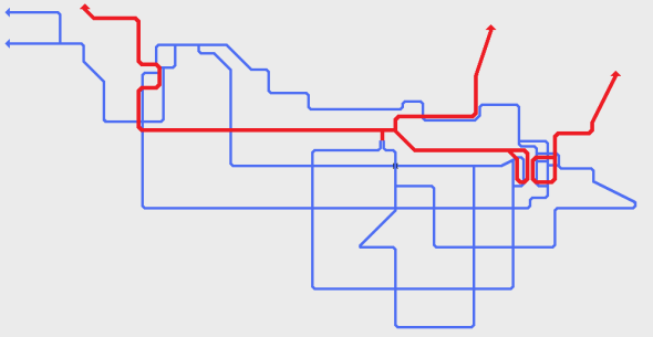
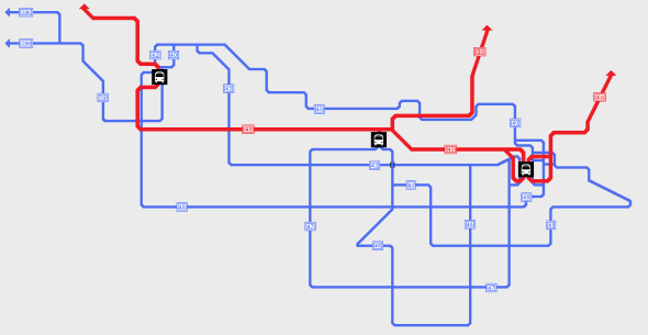
To make it more interesting though, I decided to try a completely new style of map. Some of you may recognize it as a take on a “spider map.” (If you don’t know what a spider map is, I recommend reading this post from Greater Great Washington on the spider map used by Transport for London.) Rather than doing the entire map, I just re-did the Kennewick part, which admittedly is probably the easiest part of the map to draw. So lo and behold, this is what I ended up with (though I should note this was all done on a smart phone, which was not easy…):
If you’ve been following my blog and Twitter posts for long enough, you know that I don’t really put much information in my maps. And that’s because I don’t know exactly what information I should include. There’s just too many possibilities to choose from.
For example, I could:
 Leave it completely blank with no information at all…
 Or I could show every single bus stop on every single route…
 Maybe I could include the names of the roads being traveled on…
But if I really want to be ambitious, I could show all that information at once. But I’m going to spare you from that information overload. (Let’s just say it didn’t turn out very well.)
The point is, there’s no real set standard for what information should be included in transit maps. It depends on the agency and their style of map design for what information is going to be included. And in some cases, the right combination has been found. One of my personal favorites (apart from the TfL map I mentioned earlier) is the Seattle Frequent Transit Map, which was designed by Oran Viriyincy (@oranv on Twitter).
In order to get more people using transit, we have to make it easy to understand, and maps (as well as schedules) are the first step. How do you think maps should be designed to make them easily accessible for everyone?
Update: I played around with the made a bit more today and ended up with this. There’s a bit left to be desired, but overall I’m happy with the way this map is going. Expect to see it in the future in my posts on revamping BFT.


