A Map of Transit Across Washington State
Posted: February 28, 2012 Filed under: Epic Transit Journey, Fun, Transit 4 CommentsA few years ago, I was planning a trip to visit my hometown of Whitehorse, Yukon. In an effort to see how frugal I could be, I started exploring any and every option I could find to get me from the Tri-Cities to Vancouver BC. Along the way, I learned about the Airporter Shuttle and how to use transit to get from Seattle to Vancouver BC. It was also around this time when I learned about a website called Epic Transit Journeys. Just as it sounds, an Epic Transit Journey is where you see just how far you can get using only public transportation. (Check the “Epic Transit Journey” category on the right panel to see my posts on past trips.)
The one thing that I always felt was missing from the ETJ website is a map. Without a visual aid to refer to, someone unfamiliar with Washington State who looks at a schedule for Astoria to Longview won’t be able to make sense of it. Since there is quite a few schedules covering just about every inch of the state, I figured it would just be easier to have one full map showing all the different routes one could take between cities using transit.
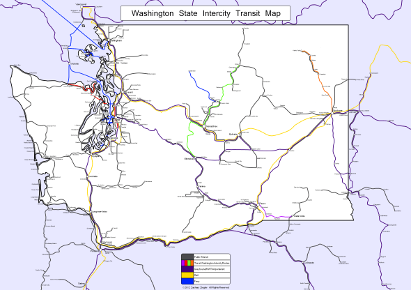
As it turned out, I wasn’t the first person who had the idea to make a map of the entire Washington State transit network. That honor goes to Zach Shaner. Just shy of two years ago, he made this map:
Apart from a few minor discrepancies, it’s a fantastic map. However, I feel that there’s a couple of problems with it. One, it is out of date (being nearly 2 years old), and two, it omits all the private intercity buses in the state. Zach mentioned in a comment on his post that his aim was to show taxpayer-funded transit. He asked his readers if anyone knew whether the state gives taxpayer money and/or subsidies for operating services, but there was never an answer. I don’t have a definitive answer myself, but I think Northwestern Trailways may get some subsidies for the bus running between Spokane and Seattle/Tacoma via Moses Lake and Wenatchee.
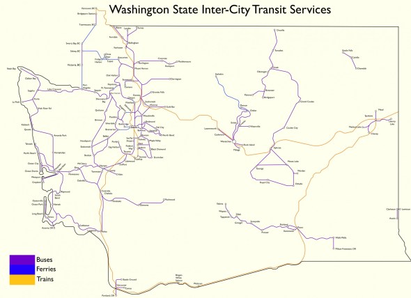
As some of my readers may have noticed, I’ve been trying my hand at making maps in recent months. Most of them have been on the smaller scale though. Since I wanted to try something on a much bigger scale, I thought it would be fun to make my own version of the Washington State Intercity Transit Map. This is what I ended up with (click to see the full version):
As you can probably see, there’s a lot of routes on the map.
When designing my map, I wanted to make sure I was including transit connections outside of Washington State. I didn’t want to give anyone the idea that transit just simply stops when you crossed the stateline. But to keep the emphasis on Washington State, only it’s border and geography are shown. The criteria for including a route on the map was pretty simple. If there’s a schedule, then you see it on the map. That stretches from routes that only run once per week (like the Ritzville to Spokane route) to the daily high-frequency routes (like the Bellevue/Redmond to Seattle routes). Demand-response services are not included, but I should note that they would fill a couple of gaps on the map (example, Goldendale to Wishram and The Dalles). Also not shown are casino shuttles, which would fill at least one gap on the map if they were shown (Spokane to Coeur d’Alene via the CD’A Casino).
On the map, there are five different categories of transportation represented. First and foremost are all the public transit routes, shown in grey. These range from most of the state’s 30 public transit agencies to routes provided by non-profits. As mentioned earlier, all routes are all scheduled services, though the frequencies cover a wide range. Second are the “Travel Washington” Intercity Bus Routes. Launched in 2007 by WSDOT, the program was the first of its kind in the nation, linking rural communities and reconnecting them to the intercity bus network. Each of the four routes has a distinctive branding (like the “Grape Line” which runs through Washington’s wine country) and color, which is represented on the map. Third are all other private intercity bus routes, shown in dark purple. The majority of the routes shown are operated by Greyhound and Northwestern Trailways, but Airporter Shuttle and Wheatland Express are also shown. Fourth on the map is Amtrak, shown in yellow. It includes the Amtrak Cascades and Coast Starlight running north/south on the west side of the state, and both branches of the Empire Builder running east/west across the length of the state. (Yellow was also used to show the Canada Line, running from Bridgeport Station to Vancouver BC.) Lastly are the ferries in the state, shown in blue. For the most part, they’re all concentrated in the Puget Sound, but it also includes the Lady of the Lake running between Chelan and Stehekin in the east side of the state. Most of the ferries are part of the WSDOT network, but also shown is the Alaska Marine Highway running from Bellingham towards Prince Rupert and Alaska, as well as the Black Ball Ferry between Port Angeles and Victoria and the BC Ferry line running between Swartz Bay and Tsawwassen.
For the most part, each community in the statewide network is shown. There are a few that I omitted, but none of them could be considered “key” destinations. The point marker for each city is sized to show which services are directly available there. For example, the marker for Bellevue only covers the public transit routes, while the marker for Seattle covers public transit, the Dungess Line, all other intercity bus lines, Amtrak, and ferries, as all those services are available in the city. In some cases, the map might show that a city is served by one or more types of routes, but that doesn’t mean that all operations stop in that city. For example, Cle Elum and North Bend are shown as being served by public transit and intercity bus, but only the Airporter Shuttle stops in both cities while Greyhound does not.
When I was making this map I tried to be as thorough as possible, maintaining at least some semblance of geographical accuracy and making sure each route/service was plotted correctly. However, it’s very possible that someone is going to find a mistake, or find something missing. I do know that there are some bus routes missing in the Seattle and Portland areas, but I don’t think any of them are routes that would be considered crucial to the intercity network. If you do find a mistake/missing route on the map, feel free to let me know! You can either leave a comment below, or send me a tweet to @ziggzagzac.


Your map is pretty good. I’ve done the Olympic loop a few times over the years. Could you talk about some of the transit connections that you’ve drawn?
I dont think anyone is operating inbetween morton>elbe>eatonville>graham/spanaway anymore. Lewis mountain highway transit dropped that line a couple years ago i think
I think you may be right. Looks like I’m gonna have to do some updating.
[…] Download Image More @ transit509.com […]