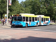
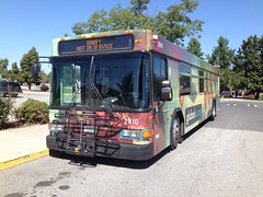
The Destination Sign
Posted: August 31, 2012 Filed under: Transit 2 CommentsPerhaps the most important feature of any public transportation vehicle is the destination sign. Without it, riders would never know which route/line the vehicle coming towards them was operating on. They come in all shapes and sizes, and can be a simple as a letter to as complicated as quantum string theory.
Historically, one of the most popular destination signs was a “roll-sign.” Just like destination signs of the present, these signs had some combination of a route letter/number, where the vehicle was heading, and what streets/areas the vehicle would be encountering along the way. The roll itself was just like it sounds, a long sheet with all the various destination signs the vehicle needed. To switch signs, most vehicles were equipped with a manual lever that the operator had to turn to get to the correct sign, but there were some vehicles that had powered levers that the operator powered on and off with a button installed with all the other vehicle controls. While rollsigns were relatively easy for riders to see, they started to fall out of favor eventually, as they could be costly to print and weren’t always easy to keep maintained.
Presently, most riders are familiar with LED destination signs. Most often seen with orange LED’s, the signs are programmed by computers by the agencies that own the vehicles. Typically, they average in a range of 16×160, giving 2560 individual LED’s for which to show a route name/number and other pertinent information. Drivers can easily use them as well, as all buses are equipped with small modules in the driver’s compartment that stores hundreds of different destination signs and messages.
As was the case with the old rollsigns, there isn’t a set “standard” nowadays for how agencies should use LED destination signs. Below, I’ll cover a few different ways that they can be used.
The Variable Message
(To see the full animation, click here.)
Simple yet effective, the Variable Message destination sign usually just has a few pieces of information. In this case, it lets the rider know that the vehicle is running on Ben Franklin Transit Route 42, that it will be traversing 4th Avenue, and that its eventual destination will be at Dayton TC. The one thing the Variable Message sign doesn’t do it identify key destinations of the route. In Route 42’s case, it passes by Amistad Elementary, Kennewick Housing Authority, Westgate Elementary, Highlander Apartments, Highlands Middle School, Edison Elementary, Tri-Tech Skills Center, WorkSource, The Colonnade, Vista Elementary, Tri-City Center, and Benton County Court and Jail. However, a rider can only find that info on a route map/schedule. So more often than not, we’ll end up with riders unfamiliar with a particular route/system who hold up the bus by having to ask the driver if the bus goes to (blank). (Of course, we can also make the argument that this is an indicator of how well the agency informs their riders, but we’ll leave that alone for now.)
The Static Message
Just like the Variable Message, the Static Message is simple yet effective. The focus of this type of destination sign is typically on the route’s main destination. In the case of Hillsborough Area Regional Transit Route 6, there are actually two: The University of South Florida and University Area Transit Center. This type of destination tends to work quite well on intercity/commuter routes, where the main destination is where the majority of the riders are headed, therefore nullifying the need for any small details about where the vehicle goes along the way. Also like the Variable Message, the Static Message is faulted because it gives no indication of destinations being served along the route. And unlike the Variable Message, it’s also faulted because it give zero indication of where the vehicle will even be going, regardless of what its main destination is. In the case of HART Route 6, a rider would need a map/schedule to know that streets travelled on by the bus include Florida, Tampa, Floribraska, 21st, Melbourne, 50th, 56th, Sligh, Puritan, Fowler, Holly, Palm, and Fletcher. Destinations the rider wouldn’t know about include Salvation Army, Trinity Cafe, Metropolitan Ministries, HART Operations Base, NetP@rk Transit Center, Temple Terrace City Hall, USF SunDome, Florida Hospital Tampa, and James A. Haley Veterans Hospital.
The Stacked Message
Similar to the Static Message, the Stacked Message doesn’t change, but it does show more information than its counterpart. In this case, the destination sign is a mock-up for HART Route 2. This particular route is the busiest in the system, and it’s rare to find a lost rider here. That’s why I felt this route would be a good example for the Stacked Message. The top line shows what road the route serves, Nebraska Ave. The bottom line is used to show the direction and what the routes main destination is. Just like all the other destination signs mentioned so far, it does fault in its lack of destinations served along the way.
The Scrolling Stacked Message
(To see the full animation, click here.)
Much like the Stacked Message, the Scrolling Stacked Message has two lines of text. However, this style of destination sign can have one or both lines of text scrolling to show as much information as felt necessary. In this case, the destination sign above is a mock-up for HART Route 30, which serves the Kennedy Blvd corridor, Tampa International Airport, and Northwest Transit Center. The bottom line of text is used to list major destinations along the way, which in the case of Route 30 could include University of Tampa, Westshore Mall, Town N’ Country, and Hanley/Waters Plaza. (Click the link above to see the actual animation so it makes more sense.) I should also note that the Scrolling Stacked Message can also be built as a Variable Stacked Message. Another feature to point out on this particular destination sign is the airport symbol on the right side. HART’s Route 30 is the only route that serves the airport, and so the airport becomes one of the key destinations on the route. Rather than having to put “Tampa Intl” somewhere on the destination sign, the airport symbol is shown at all times just like the route number. Transit agencies can also do the same thing for train/bus stations, though I personally don’t know of any examples of this.
In conclusion, I’ll say this: There is no one set standard for destination signs that transit agencies should follow. I have my own personal preferences for how they should be designed, and I’m sure most other straphangers do as well. As long as a rider can look at the destination sign and get whatever information they need to determine if they want to ride that particular vehicle, then it works.


Personally I think the A/C compressor is more important lol
Orlando’s LYNX uses a stacked message sign and while Tallahassee’s StarMetro has a variable message system, they tend to be pretty detailed with it, listing up to five or six streets and neighborhoods per route. Wish HARTline and PSTA were more specific with their destinations.
Lakeland’s Citrus Connection was still using rollsigns on a few buses up to about a year or two ago: http://www.flickr.com/photos/ferret111/4712261949/